
Building a custom Shopify storefront
My wife has been running her ecommerce business for about 6 months now. It's going great so far, but we were ready to take it to the next level, so I helped her redo the Shopify site.
This was an interesting challenge and I wanted to share what I learned.
Why
Firstly, why even rebuild it?
We have been experimenting with paid ads as well as organic social in the last few months. Honestly it was quite challenging to get traffic. Conversion rates were around 0.6% which I consider not that great.
The other thing is, we want to build a brand. A legit business for the long term.
Not some 'get-rich-quick' dropshipping BS.
The competition is tough. Especially in skincare.
Online, it's all about perception. You have to stand out.
We wanted customers to understand our values and how we're different.
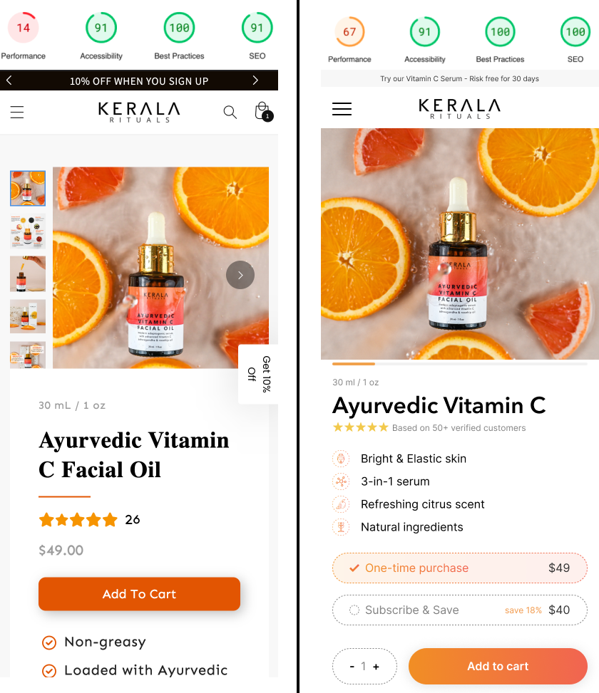
One of the best ways to stand out is by having exceptional design.
Your website is what customers will see. Wether you like it or not, they will judge your brand's quality based on the website.
So I thought it's a double win. Better conversions and increased brand value.
How
Ok, so what are the practicalities.
We had used the basic Dawn theme before with a custom product page build with PageFly.
For the new I wanted to first rethink it completely. So we hired a copywriter and I jumped into Figma.
Once we were happy with the design and copy, I started to consider our tech options. I found a couple of interesting paths:
- Buy a premium theme
- Landing page builder
- Build a theme from scratch
- Custom liquid sections in Dawn theme
- Headless store with NextJS
- Shopify Hydrogen
I did quite some research (aka watched a lot of Youtube :)) and ended up choosing the custom liquid sections path. The Dawn theme is super robust - although I found some bugs - so it should cover our basic usecases. No need to reinvent the wheel. Instead I could focus my effort into those custom pieces that's gonna really elevate the site.
In the beginning I just started coding in the Shopify web editor, because I thought it'll be quick. Boy was I wrong. It was such a pain in the ass. After a few days I dedicated a few hours to properly set up my local environment. Got the Shopify CLI, VSCode plugins, put the project on Github. They have a nice ecosystem and it made my life soo much easier.
Give me six hours to chop down a tree and I will spend the first four sharpening the axe. - Abraham Lincoln
Pro tip: take the time to setup your dev environment, it's well worth it.
Ok, so from here on it was a little bit of learning liquid and banging out some neat css.
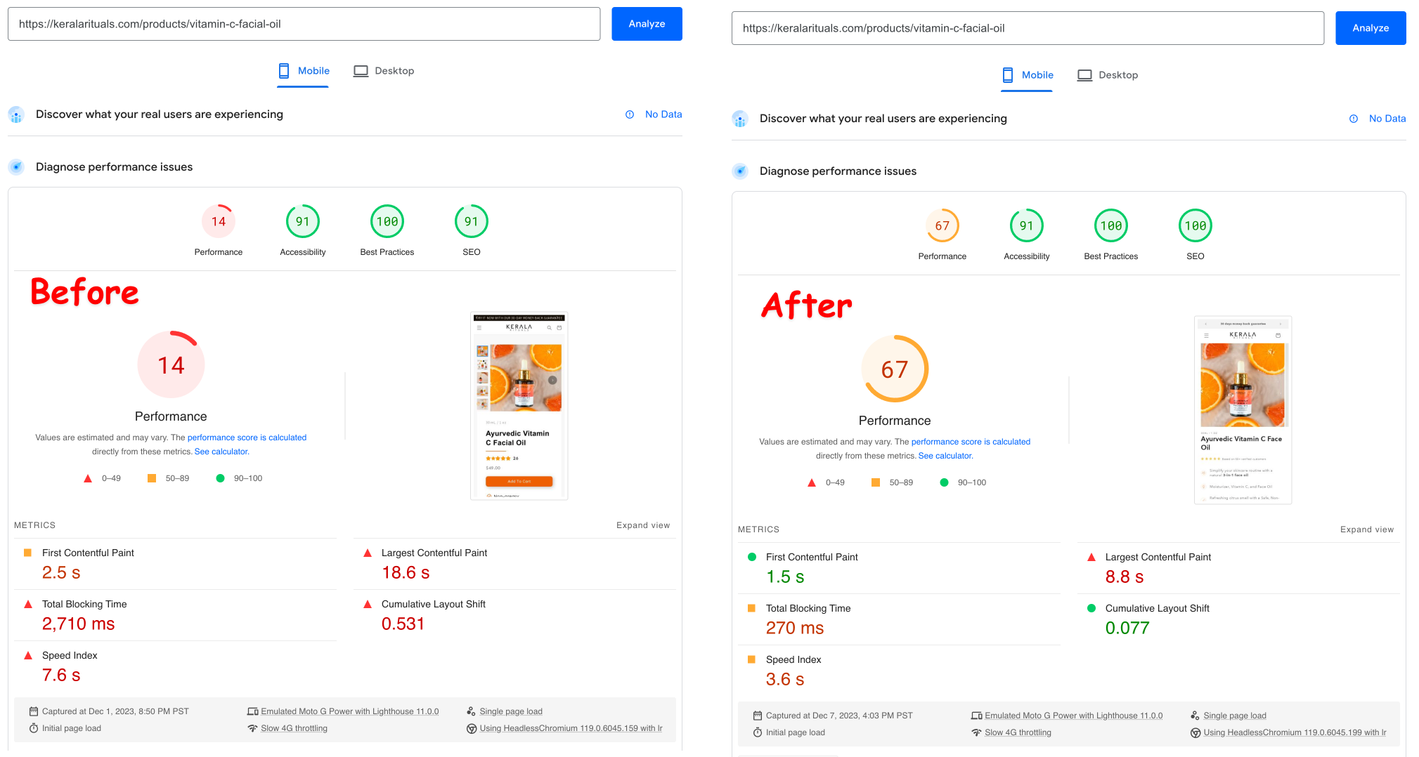
Optimizations
When I was done I took some time to clean things up and put on the finishing touches.
Images
Images are a huge part of the overall site and design. Probably the most important part to convince people to buy your product. Btw we spent a good amount of time/effort on our product photography, so even tough they are DIY it looks professional. Maybe that's a post for another time.
Images are also the biggest factor in site performance. It took me some time to understand how Shopify does things. The TLDR is that you should use the liquid image tags as below.
{{ section.settings.image |
	image_url: width: 600 |
	image_tag:
		widths: '300, 600',
		sizes: '(min-width: 400px) 298px, 78.75vw',
		style: 'width: 300px' }}
Which will render to
<img
	src="//cdn.shopify.../files/dog.jpg?width=600"
	srcset="
		//cdn.shopify.../files/dog.jpg?width=300 300w,
		 //cdn.shopify.../files/dog.jpg?width=600 600w"
	width="600"
	height="785"
	sizes="(min-width: 400px) 298px, 78.75vw"
	style="width: 300px">
I also found this blog post and demo from the Shopify performance team to be really helpful.
Then I went through and optimized sizes, names and alt tags. This guy on Youtube does a good job describing what should be done.
Transparent header
I wanted the header to be transparent above the main hero image. This seems small, but it's not that obvious how to do it. It's a small thing that helps to stand out.
This was the code in header.liquid that did the trick.
{%- if template == 'index' -%}
.header-wrapper {
	background-color: transparent;
	transition: background-color 200ms ease;
	--color-foreground: 242,242,242;
	--color-button: 242,242,242;
	--color-button-text: 18,18,18;
}

header .header__heading-logo-wrapper {
	filter: invert(1);
}
Custom footer
Again, it's a small thing. Most people leave it on the default. But I saw this a way to stand out.
I added a marquee (RIP the good old days) image section that the main footer sits slightly on top of. This made the footer, which is normally the most boring section into something interesting and visually appealing.
Again, small details matter.

Results
Ok, so it's nice but what happened?
Well our site performance metrics went through the roof :). According to Google's PageSpeed Insights, we increased our mobile performance from 14 to 65 and desktop from 34 to 85. All while also maintaining or increasing the other vital metrics such as SEO, A11Y etc.
I do not have any data about CVR improvements yet, but I will be happy to share those in a followup post.
Closing thoughts
It was an interesting project. I learned some useful skills and gained a greater understanding Shopify's rich developer ecosystem as well as web performance. Next steps will be to optimize those bad boys even more - I've entered the fine grain javascript optimization rabbit hole :)
If you were wondering, the business is called Kerala Rituals, it's an Ayurvedic skincare brand. You should check it out - it's actually pretty good.